<< Back to Warzone Classic Forum   Search

Posts 1 - 20 of 57   1  2  3  Next >>   
Site Design Feedback: 2/20/2014 06:16:20


hellokiddies
Level 56
Report
So I'm working on a new site design for Warlight since it's starting to look a bit outdated and Fizzer is busy with fixing speed issues. I just started so I don't have much, but I'd appreciate any feedback. I'm hoping to have it done in the next few weeks. Here's what I have so far:

http://i.imgur.com/p1fgcBA.png

Update: http://i.imgur.com/Kd6XFw4.png

Update 2: http://i.imgur.com/hu51l5A.png

Edited 2/22/2014 07:42:41
Site Design Feedback: 2/20/2014 13:29:59


Unreality 
Level 50
Report
I prefer Fizzer to do more updates / fix lottery games / improve ladder system before updating the site's layout
Site Design Feedback: 2/20/2014 13:39:36


UnlimitedLawlz
Level 54
Report
Well, I like it. That's about all I can say :p
Site Design Feedback: 2/20/2014 13:57:26


Guiguzi 
Level 58
Report
It is true. The logo is ugly. It is like comparing my maps to Incaman's in terms of beauty. My maps are functional but lack beauty. The current WL logo is functional but ugly. It makes me feel like I am still a child in the 1980s.
Site Design Feedback: 2/20/2014 14:03:45


UnlimitedLawlz
Level 54
Report
@Qi, the current logo is ugly? Or the newly proposed?
Site Design Feedback: 2/20/2014 14:08:50


<SNinja>gg
Level 31
Report
i like the current one fizzer has (no i am not just saying this so fizzer feels good... i really do like it)
Site Design Feedback: 2/20/2014 14:10:29


UnlimitedLawlz
Level 54
Report
Well, gg, don't you feel there should be at the least a menu update?

@Hellokiddies, I noticed the email login box. Was it intentional to leave out the Facebook login box?

Edited 2/20/2014 14:13:39
Site Design Feedback: 2/20/2014 16:19:59


hellokiddies
Level 56
Report
Everything Fizzer already has on the site will still be there, including login through Facebook. Just changing the overall look and feel.
Site Design Feedback: 2/20/2014 17:56:30


ps 
Level 61
Report
it does feel abit dated. not sure the new proposal is that much of an improvement yet, but it's not bad for a first draft. feels more 2012 atleast, as opposed to the current layout being used which looks more like early 2000. the mail icon on the corner of the proposal is a nice touch for example.

either way, i would be more concerned with structuring the whole tabs/menus/submenus things better. as new features came up it got more and more complex and it's not so user friendly to figure out where you want to go to access what you remember having seen once.
Site Design Feedback: 2/20/2014 18:36:55


UnlimitedLawlz
Level 54
Report
So what about a "forums" tab next to community?
Site Design Feedback: 2/20/2014 18:52:13


Kenny • apex 
Level 59
Report
The logo is not early 2000, it's like early 90s when everyone thought gradients and wordtext were the coolest things in the world. Do I like it? Kinda. Will the majority of people like it? No. Cut majorly back on the black.

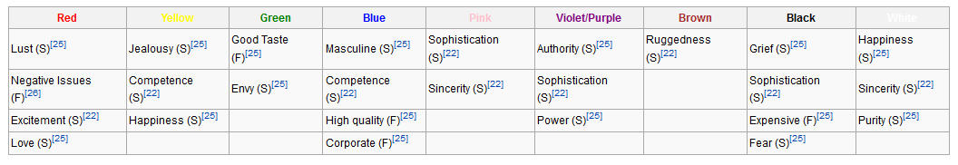
http://gyazo.com/23f628a40afba6927ffa1e77567fe777.png

Red generally inspires lust, excitement, and love. White generally inspires happiness, sincerity, and purity. Black generally inspires sophistication, fear, and grief. I guess my point here is that black inspires more negative emotions than positive when it comes to how a person is going to feel when they're browsing the site. Red and White is good. Black is generally bad for a site.
Site Design Feedback: 2/20/2014 19:32:26


Metaltubbie 
Level 61
Report
Are you kidding?
Your "new" design looks like a child played with powerpoint.
Calling it "minimalist" would be politely.
Sorry, i don't like it.
Site Design Feedback: 2/20/2014 19:49:18


UnlimitedLawlz
Level 54
Report
@MetalTubbie


Site Design Feedback: 2/20/2014 19:55:39


Incaman
Level 58
Report
Guys i think you all need to chill a bit. Let's focus on constructive criticism. "I don't like it" can mean anything. I would recommend that you try to be specific about the things you are bothered with, but also mention the things you like (if there are any :D).

Qi :D we should do a collaborative map sometime. It will be pretty and functional :D (not that your maps are ugly, I think they are quite well done)
Site Design Feedback: 2/20/2014 20:03:55


hellokiddies
Level 56
Report
@ps: Yeah I was thinking of making a drop down menu instead to clean things up and make it easier to read.

@apex: Change the entire header color or just the tabs? I think the dark gray header fits nice with the red and white logo, but tabs are too dark. Maybe I'll make them gray. Think I'll keep the mail icon black though, since it shouldn't stand out unless you got a message.

@Metaltubbie: It's just a first draft with an hour of work. A lot will change and it won't be so empty and powerpoint-like.
Site Design Feedback: 2/20/2014 20:13:28


ChrisCMU 
Level 61
Report
I don't really have any problems with the current look (colors, logos, etc). Would a freshen up by nice? Sure. But doesn't matter to me. I am more into functional changes. I want to see many items pulled out of the multiplayer tab. To me it is annoying to load all your games before going to tournament page, design maps, etc. I'd like to see things categorized under tabs better.

Also, is this something Fizzer asked you to do (or will actually consider), or are you just doing it on your own?
Site Design Feedback: 2/20/2014 20:22:29


UnlimitedLawlz
Level 54
Report
Or......what about a pull down menu for each tab? Like if you scroll over community you get a tiny menu with all the options in the sub-menu that's already up there. That way you can go directly to tournaments or forums without having to load your games or the dashboard.
Site Design Feedback: 2/20/2014 20:30:02


hellokiddies
Level 56
Report
I offered to do it since other risk-based games (atwar) have modern looking sites, which attracts more users. Fizzer already has a lot to do and probably wouldn't have time to clean up the site anytime soon. He's fine with me doing it but he's not sure when he'll implement it.

Edited 2/20/2014 20:30:24
Site Design Feedback: 2/20/2014 20:33:38

RvW 
Level 54
Report
hellokiddies,

Your current proposal looks like it can be done entirely in CSS; no coding changes necessary. Is that because of it being a first draft, our because that's all the freedom Fizzer can give you (at the moment)? That's important to know when giving feedback, as it means things like "redoing menu structure" are off the table.

Regarding your suggestion:
Your new logo does feel more "modern", but (to me) it also looks "thirteen-to-a-dozen mass-produced Flash game" (and thus, does no justice to what WL actually is).

I don't have a strong opinion on dialing up the brightness of the site (black to grey), but it does look fresher. Only problem is, don't forget a large part of the site is not the site itself, but the site being a thin wrapper about the game's Flash window. If the site has a dark grey / white / purple-with-green-dots background, I think it's almost required to let the game display the same dark grey / white / purple-with-green-dots background behind the map. I think you should at the very least make a mockup of that screen to see how it turns out (who knows, I might be wrong).
Site Design Feedback: 2/20/2014 20:38:21


Shrek
Level 58
Report
I like it, and no matter what these guys say. It still looks pretty good, and you must be stuck in the 80's to feel that way 8D.
Posts 1 - 20 of 57   1  2  3  Next >>