<< Back to Warzone Classic Forum   Search

Posts 11 - 30 of 131   <<Prev   1  2  3  4  5  6  7  Next >>   
New page: Multi-player dashboard!: 1/10/2015 04:03:46


{rp} Julius Caesar 
Level 46
Report
Too cluttered, utterly uncustomizable, I don't want to see forum posts, that's what the forum page is for, I don't want to see games I don't want to see, hence the filters in "My games" I don't nee to see the games im in settings, I've already agreed to them haven't I? I don't need the clutter, confusion. Every day you make this game more and more like the browser based games that we all came here to escape their clutter and confusion.
New page: Multi-player dashboard!: 1/10/2015 04:07:37


Жұқтыру
Level 56
Report
I agree with Julius.
New page: Multi-player dashboard!: 1/10/2015 04:19:16


{rp} Julius Caesar 
Level 46
Report
Oh and you've also seen to it to ruin the filters for the my games page. I'm more and more disappointed in you every update Fizz.
New page: Multi-player dashboard!: 1/10/2015 04:28:20


sh4d0w
Level 51
Report
Very confusing, especially for sorting through games you are active in. (Why prioritize games with recent comments, which you stopped being involved in long ago?).

However I am willing to go on the record as saying this is a WONDERFUL reconfiguration if it may lead to ~1,000 coins being deposited in my account. Thank you.

Edited 1/10/2015 04:29:18
New page: Multi-player dashboard!: 1/10/2015 04:31:34


almosttricky 
Level 63
Report
I like the new past games tab and the map of the week addition. The new dashboard could use some de-cluttering, though. I like how the "my games" tab had a little window you could scroll through the games with instead of scrolling down the page.
New page: Multi-player dashboard!: 1/10/2015 04:32:06


Metaltubbie 
Level 61
Report
First of all i thought 'what a mess'.

After this and paying some attention i saw mostly really good things.
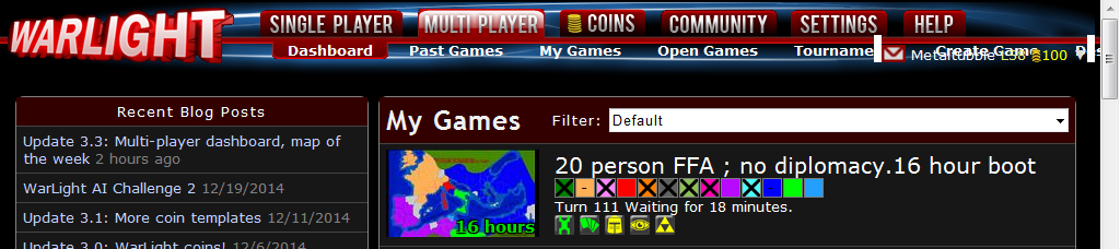
I like it scrolling on html (much faster), clicking links on it (open new games in several tabs) and seeing directly settings by symbols (no more look in the settings for useless autodistribution and such things).

But there a two little problems for me:
- With a resolution of 1024x768 the link 'CreateGame' can't be clicked anymore because it's behind the little 'account-overview' (don't know the real name).
- And this overview now looks a bit strange and different than before
http://abload.de/img/warlight-33grapicsd6ki5.png

But the 'Next-Game-Button' is brilliant ^^
New page: Multi-player dashboard!: 1/10/2015 04:32:48

Pulsey
Level 56
Report
The upside of this is that its now more efficient, and more people know about the forums.

I have to say though, its quite ugly, the dots were nicer than the dash, and those mini symbols make things look more messy and complicated than it is.

Also, it means that every time you open a game you have to go through the Warlight Loading Bar AND the game loading process, instead of just loading bar once. I really dislike this.

The old 'open page' also consists of Auto-boot info, however its gone now.

Btw, did anyone notice the eye is next to the triangle?

ILLUMINATI!!!!!!! ;)

Edited 1/10/2015 04:43:47
New page: Multi-player dashboard!: 1/10/2015 04:33:09


{rp} Julius Caesar 
Level 46
Report
Also, is this Mercer guy actually working for you or is an elaborate troll?
New page: Multi-player dashboard!: 1/10/2015 04:36:46


CONQUISTADORS 
Level 61
Report
My first impression is that's a lot of freaking bright neon colors. Looks like the bulletin board at a Mexican thrift shop.
New page: Multi-player dashboard!: 1/10/2015 04:46:32


Mercer 
Level 36
Report
sh4d0w,
Your comment
Why prioritize games with recent comments, which you stopped being involved in long ago?

We can tweak the settings to not show games you are no longer involved in. Thanks for the feedback.

Metaltubbie,
With a resolution of 1024x768 the link 'CreateGame' can't be clicked anymore

We will move 'Create Game' up a few sub-tabs. Our Goal is to get 1024 resolutions working. Thanks for the feedback.
New page: Multi-player dashboard!: 1/10/2015 05:12:02


Judeburger 
Level 59
Report
I like being able to scroll through open games and see all the settings at a glance (or with some mouse-overing) That part is great.
New page: Multi-player dashboard!: 1/10/2015 05:13:04


[WOLF] Jimmy
Level 46
Report
Don't like it. It was a terrible idea. Get rid of it.
New page: Multi-player dashboard!: 1/10/2015 05:23:11


♈§IRIÜS♈ 
Level 58
Report
i went to the page open game, but i can't tell the time... could fizzer or mercer (if not an alt) fix that?

Also, is there option to hide promotion games aka coin games and show all the open games so we don't need to click on "see more open games"?

P.S. i am ambivalent about dashboard.... if the forum is good then leave it.. but if it is about clan drama then take it away(unless fizzer can filter them) :)

Edited 1/10/2015 05:29:11
New page: Multi-player dashboard!: 1/10/2015 05:31:34


Thomas 633
Level 56
Report
The dashboard is overwhelming. There is a lot of problems in it. First is the loss of the "Actives games where I am still playing" option for games (so it would only show games you were still in). The writing on the games is too big and the colour is too much
New page: Multi-player dashboard!: 1/10/2015 06:41:36


{DARK} That Guy
Level 58
Report
Also, the setting for filtering your game "Active games where you are not eliminated" has been taken out. That was the only one I used for a reason and I would like if it was added back in. Just realized the guy above me said that, but my comment still stands.

Also, the my games page looks infinitely better than the new dashboard and I wouldn't mind if that stayed in as well.

Edited 1/10/2015 06:45:43
New page: Multi-player dashboard!: 1/10/2015 06:56:17


Mercer 
Level 36
Report
{DARK} That Guy,
What about the 'My Games' page is better? Can you be more descriptive. The more detail and feedback we get the better the dashboard will become. The 'My Games' page is going away so feedback on improving the dashboard is helpful.


Thomas 633,
We will look into Font Sizes.
New page: Multi-player dashboard!: 1/10/2015 07:04:13


Lawlz
Level 41
Report
Don't like it. It was a terrible idea. Get rid of it.
How nice to have self-entitled prats demanding things now. You gave no explanation as to why you didn't like it. I guess we should expect more of this to come as the forums grow in numbers
New page: Multi-player dashboard!: 1/10/2015 07:26:51

raucze 
Level 51
Report
I guess some of us are more used to the older, light weight, less clutterred version of Warlight. Personally, I felt the new changes are a bit heavy @ first sight.

Way back warlight was likable because it was easy, smooth on the eyes, nothing flashin around the screen, this was before levels were introduced, not even ads for non members.
But now the website seems to be getting heavier on the content.

I wish members had the option of switching to version they are more suitable withliek - warlight 1.0 or 2.0, the newer versions are simlpy annoying. How difficult is it to use filters on the My Games tab? if that was too incovinient then why at all play?

But thanks for keeping the game play the same:) I really love the game play and wouldn't want to change much about it.
New page: Multi-player dashboard!: 1/10/2015 08:12:41

Yeon 
Level 61
Report
It would be nice if it became clearer at a glance who has not yet submitted orders (the big black box in the middle of the coloured box worked great).
It would be nice to be allowed to disable both the icons and the "X days"/"X minutes" written on the maps.
It would be nice to be allowed to remove forums from the page.
It would be nice to be allowed to remove tournament invites from the page.
It would be nice to be allowed to remove open games from the page.
It would be nice if the "my games" section took up the entire screen instead of just a small part of it, because the small size makes it cluttered and hard to look at.
It would also be nice if the ordering and filtering from the old "my games" could be used on the new dashboard (currently it doesn't work like that).

Obviously the top request would be to be allowed to remove promoted games, but I don't think it helps any to ask for that, as I assume forcing us to look at promoted games is the whole reason for WL 3.3 :)

A suggested implementation could be giving the dashboard a link to a simple HTML settings page with checkboxes - or you can put it as a new subsection of the settings tab.

That specific enough?

Edited 1/10/2015 08:15:02
New page: Multi-player dashboard!: 1/10/2015 09:58:35


Latnox 
Level 60
Report
Personally I think it's just a matter "got used to" some things.

I like icons instead of description. You just need to memorize some of them to be able to pick game with settings you like.
But if "my games" and "open games" tab are to be removed, I think you should have option to collapse/expand sections you don't use atm (like "+", "-" icon next to it).
also old filters, like many before me noised should be restored.

EDIT:

something like this:


Edited 1/10/2015 10:08:59
Posts 11 - 30 of 131   <<Prev   1  2  3  4  5  6  7  Next >>