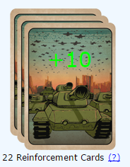
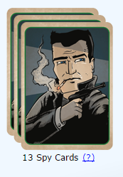
I like the new design, but it's hard to distinct. I would recommend that the different cards had different color scheme, now there is too much greenish colors in it.
+1 to "They lack of minimalism and clarity, it's very hard to tell them apart since they all have the same colors"... One thing nice about Warlight is that it is clear and simple, unlike some other games. E.g., for those who know, compare HMM3 to HMM4/HMM5. HMM3 is a clear and simple classic people still play, unlike more fancy 3d-ish but annoying HMM4/5. Old cards were easy to distinguish, different colors, plain and simple... however, clearly some like these new cards.
But this is one of the debates that can be easily resolved - why not just make a UI option to disable card images? Unlike new ladder maps etc. this is not an either-or option, this can be easily personalized!
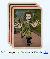
I and all players I play with still use Abandon for "Emergency blockage Card", because no one dares to spell it out, EBC is too unfamiliar to most and E-Blockage too risky to be mistaken for just Blockage.
And now Visuals! I liked that I could just see the card and play them without having to make sure what they are called! Simplicity is primacy for me as well! Although will get used to them after few games, no problem. Just still would prefer the old-look, maybe there is a market for uservoice to have setting option to switch back!?
And thirdly, yeah modern warfare is something I would stay away. Warlight ain´t match for AtWar and should appeal to other theme. I like the visuals, but would gladly welcome some stone-age humour or 1800 parody of warfare :)
In the end, I do not really see how 3-week-update to add Card Visuals improves the game at all? They look nice and thats all, maybe useful for DeviantART. And I doubt it draws in new people as well? Bad to see that as "immediate roadmap" over dozen essential updates community yearns for!
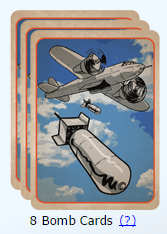
The fact that these cards are ugly according to some people here, really this is not important at all.
The most important thing is that Fizzer keeps making minor changes (like renaming cards such as the very useful "emergency blockade card"...), and does not give a damn about Uservoice's suggestions, ignoring suggestions having thousands or hundreds of votes which have been ignored for some during 4 years. Again this is imo the main problem.
I don't know why he's doing this though, Warlight is losing it's charm and simplicity.
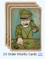
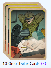
Btw, the reason the cards look so disjointed is because the card border colours have also been switched around. I don't know why, this makes no sense to me, but your brains are unfortunatly going to feel woozy looking at them for a long long time...
EDIT: For an example, look at the delay and priority colours.
I have to agree here that the new cards are less distinct than the old ones. Don't get me wrong, I like the art of these but not on the cards. Warlight was always a game where you could hop in very quickly, just do your turn and leave again. Even if you were a little distracted. Now I forsee a lot of unintentionally played cards just because people mix them up in a hurry.
As mentioned earlier, an option to choose between the different art styles would be great.