Honestly, no, it doesn't seem that bad to me.
Anyone who often plays on other diplomacy maps such as 30YW is probably already used to having conflicting player and border colors. It's a small detail that doesn't even cross my mind. Hell, if you sent me that picture without saying anything, I'd probably just say "nice! what's the scenario in play there?".
World Nations is very popular because players keep their uniform appearance when they spread around.
Untrue, that's some nitpicking there.
If you're going on nitpick mode, at least go deeper into it; both World Nations maps actually have different borders for different countries. Doubt it? Well, check this out!
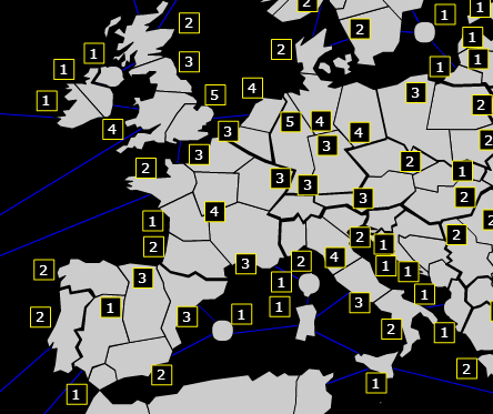
It's really, REALLY clear that borders have a different width - national borders are very thin, while international ones are considerably larger. And nobody complains about it; you have to be really nitpicky to be annoyed by that. It's not really a big deal.
WN2014 is not known for that, it's known for:
1) Single territory bonuses makes it easy to balance and distribute
2) The map is general is fairly good
3) It's the easiest one to make custom scenarios at
4) Simple games with simple rules and distribution are very popular on Real-Time games
So, if you ask me, I say keep the colors. It looks great, and lets you get used to political borders much easier imo. On maps like this I'd probably not do things like thinking Balochistan is part of Iran...


